30 July 2009

Ancient History (Zombies! Clones! Trespassing!)

I'm not really sure what made me think of it, but today I realized that I took a Digital Photography class junior year of high school. It was hell. There were about three of us in the class who actually cared — everyone else was just there to get an art credit — but the teacher took an immediate disliking to my being a smartass and promptly assigned me a horrible partner, showed nothing of mine in the gallery, and gave me a B. I'm still a bit angry about that. Guess I deserved it for being a smartass, though.

Anyways. I was going through these pictures and, while they're mostly attempts to be artsy while conforming to the lesson, there were a couple that I sort of thought were worth putting up here. I can't find the originals, so all I have are the resized/compressed Facebook versions. Sorry. They're around here somewhere and, if I find them, I'll put them up.

First, there's a theme project I did on "Urban Decay," which, technically speaking, isn't the most urban. I visited a then-abandoned (now-demolished... RIP) truck depot and the vestiges of an old house nearby, neither of which being anywhere near anything urban. For the most part, it's not really anything to write home about, but I like to put all of my adventures in breaking-and-entering up here, especially since the truck depot was leveled last fall.

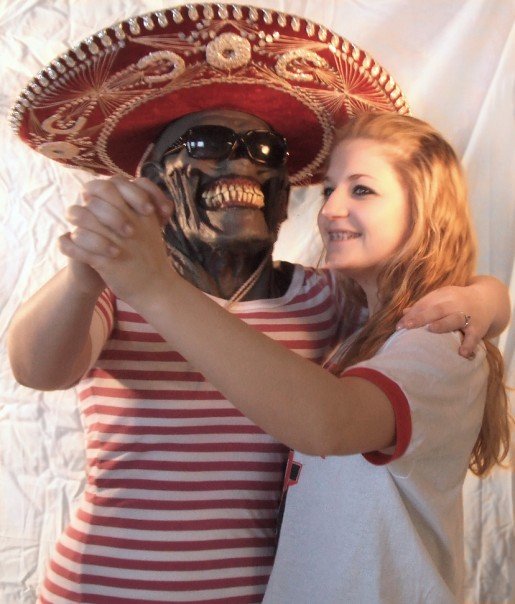
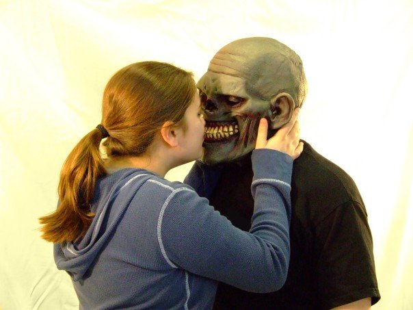
Then we've got these lovely numbers I did for my portrait assignment. I own that mask. It is a wonderful mask. It frightens children.


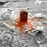
Lastly, there's my final project. I had no idea what I was going to do, but I knew it was going to involve a box and a sword. Lacking a sword, I drove to Graham's house to borrow one. Because, really, if you need a sword, that's where you're going to go. He wasn't there, but Sam was. And then this just sort of happened. I happen to like it a lot, shoddy as the photoshoppery is (and my lack of a tripod). It's called, "Attack of the Clones!" If you can't see the slideshow, click here to get to the album.


28 July 2009

Typography Tuesday - Fonts in Books in Fonts

Today, the theme is meta, inspired by a slough of music I am listening to this week. The headliner is Patrick Wolf, whose song “The Magic Position” says, “You put me in the magic position/to live to learn to love, in the major key.” This is meta. Discussing music theory within music is tongue in cheek, but this song also takes it a step further with rising major scales in the background. Another example of this is Jeff Buckley’s Hallelujah: “It goes like this, the fourth, the fifth/ the minor fall and the major lift/ the baffled king composing Hallelujah.” (Also see: that song from the Sound of Music: “Do! a deer! A female deer.”)

You get the point.

I love this tongue in cheek/artsy self-awareness, whatever media. Today’s typography grabs this theme, and is called Book as Type. Books are filled with fonts. This font is filled with books, which are filled with fonts.

As the creator, Amandine Allesandra, notes in this picture, “A book that is shut is but a block.”

And here is the alphabet- so colorful and gay!

What would be even cooler is to do a renegade setup of this in a library—a kind of underground typography vandalism. Leave your favorite librarian a special message—nothing says “I love you” like “I screwed up the order of your books for art.”

26 July 2009

Green Windows (Well, technically, aqua, or turquoise, or something)

Well, who'd'a thunk? More pictures of the cement plant? What a surprise! (psst: You can see the window from the second picture in the first picture! 1000 points to whoever can find it!)

--


--

This whole tonsil thing is pretty dumb. On Friday, when I got them taken out, it honestly wasn't so bad. But it's gotten progressively worse over the past couple of days. I'm not sure if it's the pain level or my annoyance with it that's increasing, but it's to the same effect. I can barely think; as per the doctor's orders, I've been fed a steady dose of Vicodin once every four hours since Friday. This has resulted in sporadic sleep, confusion, disorientation, difficulty keeping track of time, and general frustration. I don't really know why I'm whining here though. I mean, things could be a lot worse. I get a bunch of ice cream (even if all I really want is a Crunchwrap). I no longer have tonsils, which means I'll stop getting sick all the time. But no, I have to complain. Sorry. I'm also sorry if this paragraph made absolutely no sense; I'm having a bit of trouble thinking, what with being constantly drugged and all. Oh well!

Ariel will be around on Tuesday to talk to you guys about fonts!

24 July 2009

Tonsils!

Tomorrow (I guess technically today), I'm getting my tonsils taken out. I'll definitely try to blog ASAP, but it's very possible that I won't feel like it at all. At the very least, there'll be Typography Tuesday. And I really want to get the other photoset from Columbia-Portland up soon, so probably that. But it's probably going to hurt a lot. Just a heads-up.

21 July 2009

Typography Tuesdays!

I really like fonts, but I don't know as much about them as I'd like to. To help with that, I'm going to be doing a weekly Typography Tuesday here. Ariel is probably going to help with it here and there, as well.

I suppose my fascination with type started when I read this article about the Obama campaign's graphic design choices. The relevant bits:

"Then the lettering. Obama's identity contrasts a Hillaryesque serif typeface with a squiggle-free sans-serif presumably to imply that he combines gravitas with youthful vigor. Originally the letters were upper and lower case, which designers generally deploy to convey friendliness. As the campaign progressed, they have switched to all-upper case, which looks more authoritative, just what Obama wants. The sans-serif font changed, too: from Gill Sans, created by the British designer Eric Gill in the early 1900s, to a contemporary American one, Gotham.

Great choice. No typeface could seem better suited to a dynamic, yet conscientious, American public servant. Inspired by the handmade signs of 1940s New York, Gotham was designed in 2000 by Jonathan Hoefler and Tobias Frere-Jones, originally for GQ magazine. It has since appeared on everything from organic food packaging, to the Freedom Tower cornerstone at the World Trade Center site in New York. You don't have to be a typographic historian to get the message. A glance at the lettering on the "Change" banners at Obama's rallies conveys a potent, if unspoken, combination of contemporary sophistication (a nod to his suits) with nostalgia for America's past and a sense of duty."

Now, this blog is written in Verdana -- which is kind pretty much the way your Kindergarten teacher taught you to make letters (I didn't want it to distract from the images). My résumé is written in Georgia, which is very refined and businesslike; it reminds me of a small-town lawyer, like from a John Grisham novel. But I can't really pretend to know anything about "a potent, if unspoken, combination of contemporary sophistication ... with nostalgia of America's past and a sense of duty." So, I'll just be talking about fonts and, hopefully, I'll eventually be able to sound like I know what I'm talking about.

To get things rolling, here's a font made with a car!

There are more pictures on flickr, and the font is available for free download here.

When I was talking to Ariel about this yesterday, she showed me the Jockstrap font, which is just adorable.

That's all I really have for today. If anyone has suggestions on where they'd like to see this segment go, please don't hesitate to comment and let me know. I'm really open to ideas.

20 July 2009

Domain Name

I just set up a domain -- www.operationkhaki.com now points here. the old address, somethingsymbolic.blogspot.com, still works. That's all.

19 July 2009

Columbia-Portland (Int)


-

-

-

-

-


--

There's another set on the way, once I get it finished.

Cement


FINALLY made it to Columbia-Portland Cement. It was beautiful and awe-inspiring. Pictures tomorrow (so long as nothing unforeseen happens), but a couple of thoughts now:

- What am I doing wrong? The awesome overcast skies became vague overpowering white (see: above photo). Maybe I need to play with my light metering?

- I hope every tick dies.

- Gasoline is expensive.

- The Sheriff's Dept. uses it for training. There are giant signs at the entrances saying not to trespass, and that there is live fire, and that you'd better hope it kills you, because otherwise you're getting prosecuted. There were quite a few cars over by some outbuildings, and we started to get a little nervous. We heard an approaching car; inside was a policeman who smiled and waved, and then drove off.

- The bridge was so scary.

- Did you know that you can make a ghetto camera flash diffuser by taping part of a white grocery bag to the flash? True fact!

Bonus picture of me being badass/inches from death:


And because Kathleen was so kind as to take that picture, here's one of her being pretty badass herself:


--
I figure this is the best place to tell you about a couple of really awesome things I found today

Pictaculous
creates a color theme around a picture you upload. I can think of about a million uses for this. It's pretty snazz.

Foundation Cartier por l'art contemporain has a really nifty look at graffiti. I love graffiti, and this is really cool, and you should check it out. I haven't had much time to play with this, because I just found it when I got home, and have been up to my neck in photos, but I really look forward to it.

Alright, guys, I'll see you tomorrow.

EDIT: Oh, I forgot something really cool!

The building we went inside was FULL of cement dust. Over the years, the moisture leaking through the building had caused it to form stalactites and stalagmites. It was awesome. Cement is, what, limestone or something? Or it at least has some in it to account for these? Oh well. It was the best.


17 July 2009

Fishface

Did this while trying to sleep last night. Dunno. Whatev. Apparently I never learned to color in the lines. There was also a penguin-Fonzie thing but it wasn't very good.

--


--

In other news, I was reading BOOOOOOOM! yesterday and came across Alison Malone and her wonderful collection of photos about the Daughters of Job, a secret society of some sort or other. Go to her site to check out the full set. They're peachy keen.


--

Alright, off to Stan Hywet with Hayley to watch As You Like it.

14 July 2009

You And Only You (Orange)

I can't get the colors right in the picture. Sorry. It's, uh, oranger in real life.

Ink and watercolor on paper.

--


13 July 2009

Hunger

I don't want it.

I want it.

Like a junkie, needle poised—
Like a glutton clutching his fork—
Like a slut taking off her pants—

I want it.

I don't want it.

They know that feeling, too:
I'll only want it more,
It can't outlast my hunger.

I don't want it.

I want it.

08 July 2009

The Little Match Girl

Get ready to be saaaaaaaad...

Overunder

I'm sick today. So, instead of doing anything productive, I learned new photo software!

Adobe Lightroom is awesome. If you take pictures, get Lightroom. I was using Picasa as a photo library, but Lightroom is easier and gives you much more control over organization and editing. I need to reorganize my library to work better with it, but it's oh so very shiny, really. Lightroom is like if Photoshop were iTunes, if that makes any sense.

I also got Noise Ninja which, well, reduces noise. It works very well, much better than Photoshop. Blurs images a bit, but Lightroom's clarity setting can fix that right up. Then, Photomatix, which makes HDR pictures. I need some more time to learn this stuff, but I have a general working knowledge right now.

There was a panorama I posted a while ago, and I don't think I ever linked to the software I used to make it. I used hugin. It's the best panorama stitcher around, as far as I've heard, and it's free. It's a little intimidating to use at first but, once you play with it a bit, it makes sense.

Enough of my talking. This photo is from Moab. It was my HDR guinea pig.

--


--

Oh, and I'm hopefully going to make it back to the cement plant sometime this week. Fingers crossed.

05 July 2009

Flagellate

Hayley and I went to fireworks with my family last night. By "fireworks," of course, I mean that we were at a family friend's, blowing things up. This is of questionable legality.

I brought my camera somewhat reluctantly, because my remote is either out of batteries or broken. Long exposure shots, especially of fireworks, don't work too well without a remote. I didn't even bring my tripod. (Incidentally, there is a great guide to shooting fireworks here
-- never mind that I almost totally ignored it.)

Nevertheless, I was able to get a couple of decent shots, this being one of them.


--

(P.S. I am so very glad Hayley is back. I missed her quite a bit.)

02 July 2009

I'm painting a painting!

Don't start expecting great things or anything. So far it's ink and tempera on yupo. But I probably won't be posting much until it's done. That could be today or tomorrow, but it depends a lot on the rain. My only space is outside.